Now Reading: Optimizing User Experience with Progress Indicators in UI Design
-
01
Optimizing User Experience with Progress Indicators in UI Design
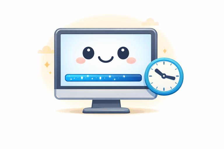
Progress indicators are crucial elements in user interface (UI) design. They provide real-time visual feedback during operations that involve waiting, such as loading content or uploading files. When users interact with digital products and need assurance that a process is moving forward, progress indicators play an essential role not only in managing expectations but also in reducing perceived wait times. For inspiration and design ideas, browse various examples of progress indicator UI on Mobbin.
Well-designed progress indicators offer transparency. They inform users about the status of background operations that might otherwise seem invisible or slow. By providing an immediate sense of progress and remaining effort, these UI elements build user trust and prevent frustration. UX professionals emphasize that visual feedback through progress indicators lowers task abandonment rates and helps retain user engagement throughout a process.
The psychology behind effective waiting UI is rooted in predictability and feedback. When users lack confirmation that their action is being processed, they may assume the application is broken or unresponsive. According to the Nielsen Norman Group, even a simple animation during waiting periods reassures users and improves satisfaction with digital products.
A successful progress indicator makes seemingly long waits feel shorter and gives users a sense of control over their actions, ultimately boosting the perceived quality of the overall product. Careful design selection based on context and duration can make all the difference in how an application is received.
Importance of Progress Indicators
Progress indicators shape how users perceive waiting times by offering clear visual cues. They minimize anxiety and make tasks feel more predictable. For example, during a file upload or data sync operation, progress bars or spinners let users know their commands are being executed. This assurance is key to reducing negative emotional responses and retaining users during processes that would otherwise feel tedious or ambiguous.
Research highlighted by Smashing Magazine indicates that progress feedback increases usability and leads to higher satisfaction, especially during tasks that last more than a few seconds. Overall, progress indicators deliver clarity and confirmation, both of which are essential in today’s fast-paced digital environments.
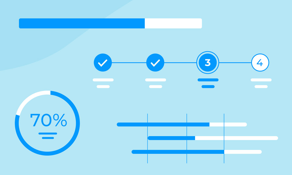
Types of Progress Indicators
Progress indicators generally fall into two main categories that serve different user needs and system requirements:
- Determinant Indicators:These show a quantifiable portion of work completed, typically as a percentage or a progress bar fill. They are ideal for tasks with a known total duration. Examples include loading a webpage where resource sizes can be predicted.
- Indeterminate Indicators:These represent that activity is ongoing but do not specify completion time or percentage. Indeterminate styles are used when the system cannot accurately predict how long a task will take, such as initial server communications.
Standard progress indicator styles include linear progress bars, circular spinners, and activity dots. Designers choose each based on platform conventions, task context, and available information about the underlying process.
Best Practices for Designing Progress Indicators
To build effective progress indicators, designers should follow several best practices that prioritize clarity and user engagement:
- Be Informative:Communicate the current status with clear labels, indicators, or percentages. If possible, display both elapsed and remaining time.
- Maintain Consistency:Apply a unified design language for similar processes. Avoid mixing indicator types within a single flow unless necessary by context.
- Use Animation Judiciously:Include smooth, subtle motion to show the system is working. Avoid jarring transitions that can unsettle users or indicate errors.
- Design for Accessibility:Ensure indicators are easily visible under different conditions and compatible with assistive technologies. Use sufficient contrast, size, and accessible patterns.
For example, linear determinate progress bars with well-labeled percentage values are effective during uploads, while animated spinners are typically reserved for brief, unpredictable waits. Always match the indicator type to the user’s informational needs and the system’s ability to predict timing.
Modern Trends in Progress Indicator Design
Progress indicators have evolved to keep pace with contemporary design principles. Several key trends define their current implementations:
- Adaptive Colors:Recent indicators often use colors that align with dynamic system themes, user settings, and brand palettes. This creates a visually harmonious and inclusive experience.
- Microinteractions:Designers incorporate tiny, purposeful animations or response cues. For example, a progress bar may pulse softly during waiting or animate the transition between stages, signaling completion or errors.
- Spatial Intelligence:Leverage motion and depth to make indicators more engaging and intuitive. Progress that advances or recedes in apparent depth can hint at complex processes, making the wait feel more purposeful.
These trends reflect a broader movement in UI design that values responsive, emotionally intelligent interfaces.
Case Studies of Effective Progress Indicators
Some of the world’s most impactful progress indicators stem from large platform updates and design systems.
- Google’s Material Design 3:Google introduced stop indicators and rounded endpoints for linear progress bars. These updates make progress states clearer and more inviting, helping users quickly interpret task status.
- Android Live Updates:Android’s interface refined Live Updates by extending the progress bar width and making important actions more visible. This improvement aids real-time feedback and lets users act on progress more intuitively.
These approaches demonstrate the measurable returns of design innovation, showing that even small updates, such as clearer stop points or improved contrast, can dramatically improve user comfort and clarity.
Conclusion
Progress indicators are indispensable in maintaining user trust and engagement during processes that naturally involve delays. Thoughtful application of best practices, attention to accessibility, and a willingness to leverage modern design trends ensure that these UI elements are both useful and appealing. By investing in robust progress indicator design, product teams can enhance perceived performance, retain users, and deliver more satisfying digital experiences.