Now Reading: Designing User-Friendly Website Navigation Menus: Best Practices and Common Mistakes
-
01
Designing User-Friendly Website Navigation Menus: Best Practices and Common Mistakes
Designing User-Friendly Website Navigation Menus: Best Practices and Common Mistakes

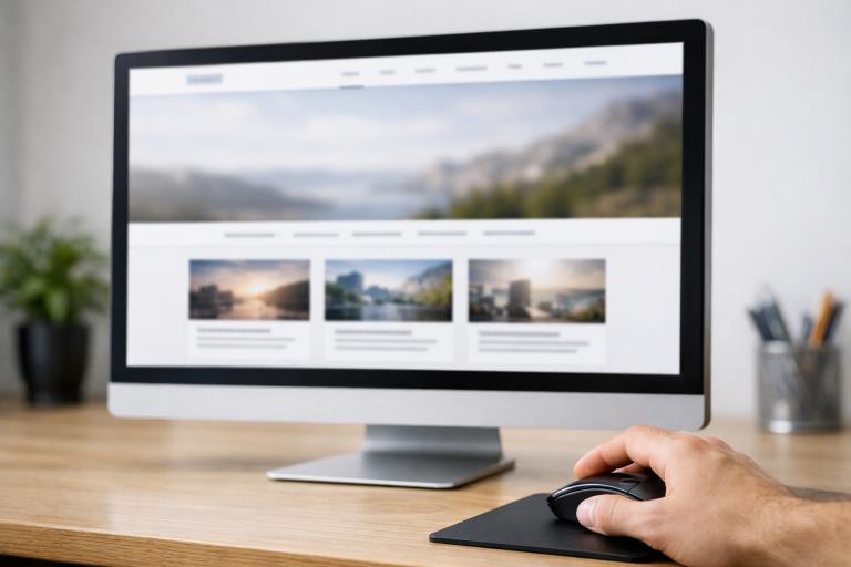
Effective website navigation shapes not only how visitors experience your site but also how easily they find what they need. When users arrive on a new website, the navigation structure guides them in understanding the available content and moving smoothly from one section to another. For practical inspiration, reviewing navigation UI examples can provide valuable guidance on designing menus that are both attractive and usable.
When navigation is clear and intuitive, visitors can quickly orient themselves, locate the information they need, and are more likely to stay engaged. Poorly designed menus, on the other hand, often leave users confused or frustrated, resulting in higher bounce rates. Creating a logical and streamlined navigation experience is essential for user satisfaction, driving engagement, and supporting your overall website goals.
Research from usability experts emphasizes that most users decide where to click within just a few seconds of scanning a navigation menu. Structuring information in a way that supports quick decisions is therefore not a luxury but a necessity. A thoughtful navigation system also lays the groundwork for accessibility, ensuring everyone can browse your site with ease.
Before diving into design and implementation, it is important to understand the range of navigation menu types, address mobile needs, consider accessibility, and adopt a testing and iteration process. Let’s explore the most effective strategies for making your website navigation user-friendly and error-free.
Importance of Clear Navigation
Navigation serves as the roadmap for your website. A clear navigation system is essential because it helps users understand where they are and how to get where they want to go. When navigation is confusing or cluttered, users are more likely to abandon your site and look elsewhere for solutions. Studies show that straightforward navigation is one of the strongest contributors to high user retention and positive brand perception.
Types of Navigation Menus
Recognizing the various types of website navigation menus enables you to select the style that best fits your content and user needs:
- Horizontal Navigation Bar:This familiar menu style typically sits at the top of the page and highlights primary site sections. It is best for spotlighting your essential offerings.
- Vertical Sidebar Navigation:Often used for blogs, dashboards, or admin interfaces, column layouts provide more links and allow for straightforward vertical scanning.
- Dropdown Menus:Dropdowns reveal subcategories or additional links when the main menu item is selected or hovered over. They organize multi-level content efficiently.
- Hamburger Menus:Recognizable by three stacked lines, this icon condenses navigation into a hidden menu, which is accessed primarily on mobile or minimalist desktop sites.
- Mega Menus:For large websites with many categories, mega menus allow you to display an expansive array of links within a single, visually organized panel.
Best Practices for Designing Navigation Menus
To make navigation more intuitive and user-centered, consider the following practices:
- Keep It Simple:Limit primary menu items to five to seven. Too many choices overwhelm users and slow decision-making.
- Use Descriptive Labels:Each menu label should make its purpose obvious. Avoid general terms like “Services” when a more specific term would help users decide faster.
- Ensure Consistency:Place your navigation in the same spot on every page, and use a consistent look for menus and links.
- Prioritize Important Pages:List the most-used or highest-priority links first or last, since these get the most attention.
- Incorporate Visual Cues:Use highlighting, icons, or underline effects to indicate the user’s current location or hovered menu items.
Common Navigation Mistakes to Avoid
Learning from common errors can improve user experience and keep your site organized:
- Overloading Menus:Including excessive links distracts and confuses users. Stay focused on essentials.
- Using Vague Labels:Terms like “Things” or “Misc” leave too much to the imagination and frustrate users.
- Inconsistent Navigation:Moving menus, changing link positions, or visually altering navigation across sections disorients visitors.
- Neglecting Mobile Users:Navigation that isn’t optimized for touch or small screens can lead to missed content and user drop-off.
Mobile Navigation Considerations
Mobile devices now account for a significant share of website traffic. Designing for smaller screens requires a careful approach to navigation:
- Responsive Design:Your navigation must adapt to all screen sizes. Test menus in different orientations and resolutions.
- Touch-Friendly Elements:Ensure each clickable area is large enough to tap comfortably, reducing accidental selections.
- Collapsible Menus:Use expandable structures such as hamburger menus to save space while keeping navigation accessible.
Accessibility in Navigation Design
Web accessibility means ensuring everyone, regardless of ability, can navigate your site. Accessibility should be built in from the start:
- Keyboard Navigation:People who cannot use a mouse need to navigate menu items using keyboard shortcuts or tabbing.
- Screen Reader Compatibility:Use semantic element markup and ARIA roles so screen readers can properly interpret menus.
- Contrast and Readability:High contrast between text and background, along with legible fonts, improves navigation for users with visual challenges. For more on accessibility, see the W3C Web Accessibility Initiative’s guidance.
Testing and Iterating Navigation Menus
Navigation is not static. Continuous evaluation and improvement are necessary for long-term success:
- User Testing:Ask real users to try your site and gather feedback about the navigation’s clarity and ease of use.
- Analytics Review:Web analytics help you track where users drop off or which menu paths get the most use, offering data for tweaks.
- Continuous Improvement:Regularly update navigation based on feedback and analytics to meet evolving user needs and expectations.
Conclusion
Website navigation is much more than just a set of links. It is the foundation of the user experience. Consistent, clear, and accessible navigation guides visitors to your most important content and supports business goals. By embracing best practices, avoiding known mistakes, and remaining committed to ongoing improvement, you can ensure your website is welcoming and simple to use for all visitors.